קו משווה
Kav Mashve

קו משווה היא עמותה שהוקמה במטרה לקדם את השתלבותם של אקדמאים ערבים בשוק העסקים הישראלי.
כשניגשים למיתוג חדש הדבר הראשוני והחשוב ביותר הוא התייחסות לקהל היעד - השפה, התרבות והמנהגים שלו. לכן, המיתוג של עמותת קו משווה – הפונה למעסיקים ישראלים מחד ולצעירים מהמגזר הערבי מאידך, שלח אותנו למצוא את שביל הביניים למותג והתאמתו לקהלי היעד השונים ולתכנים המגוונים.
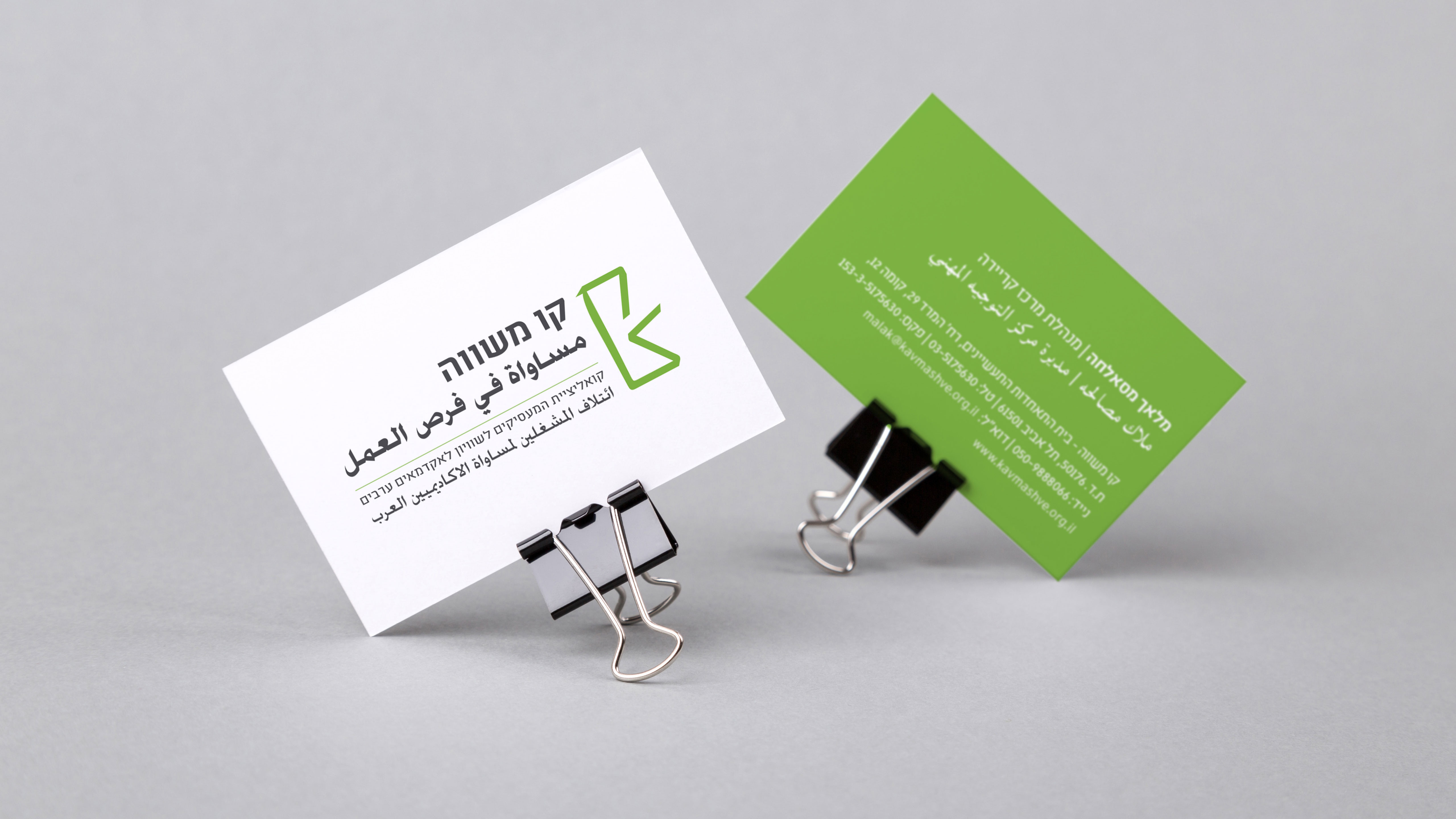
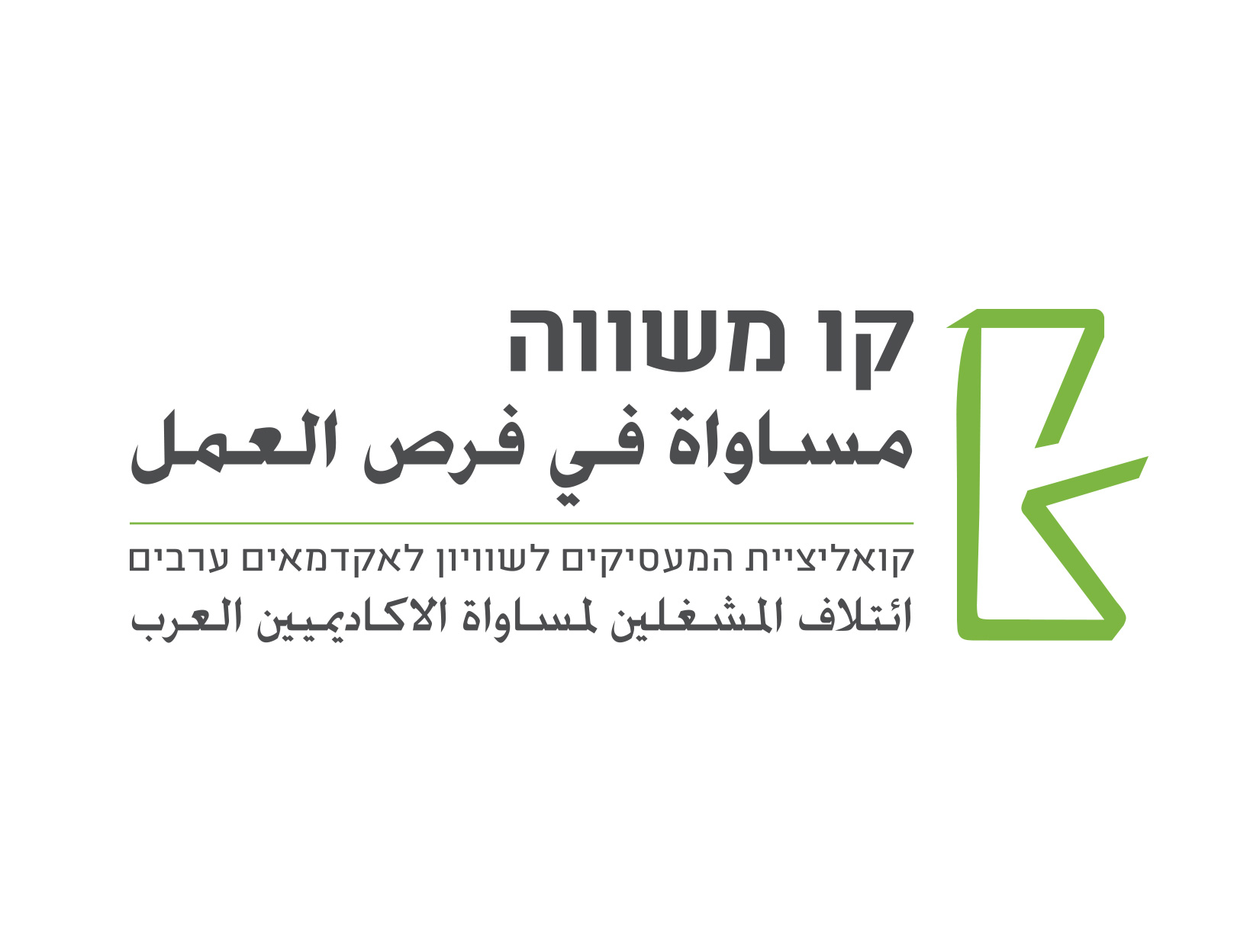
בעבודה על הלוגו יצרנו חיבור בין אות עברית לאות ערבית וכך נוצרה שפה טיפוגרפית ברורה וחזקה אשר הובילה את המותג.
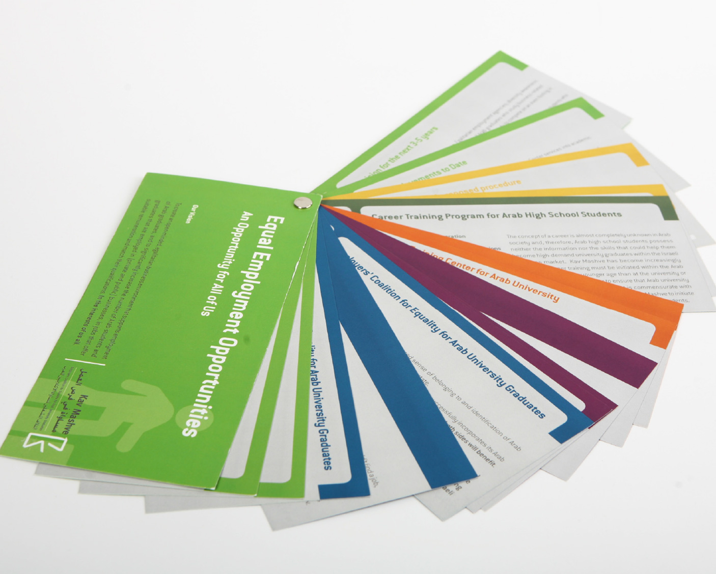
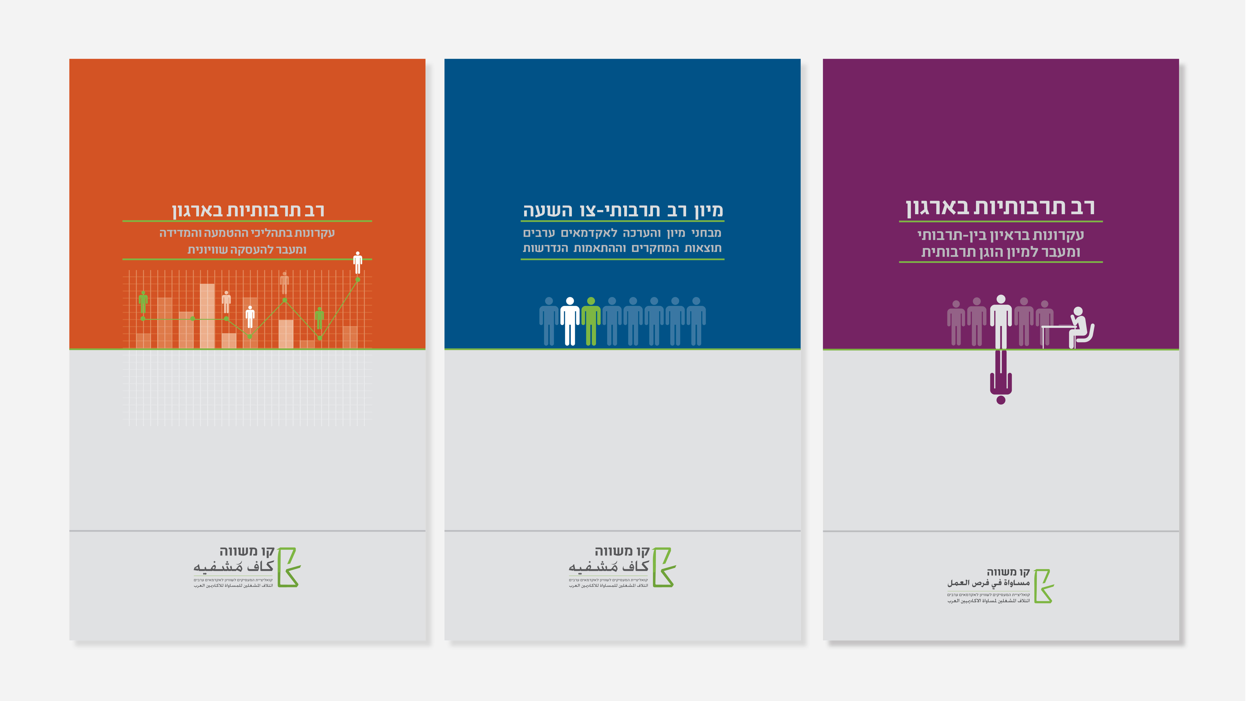
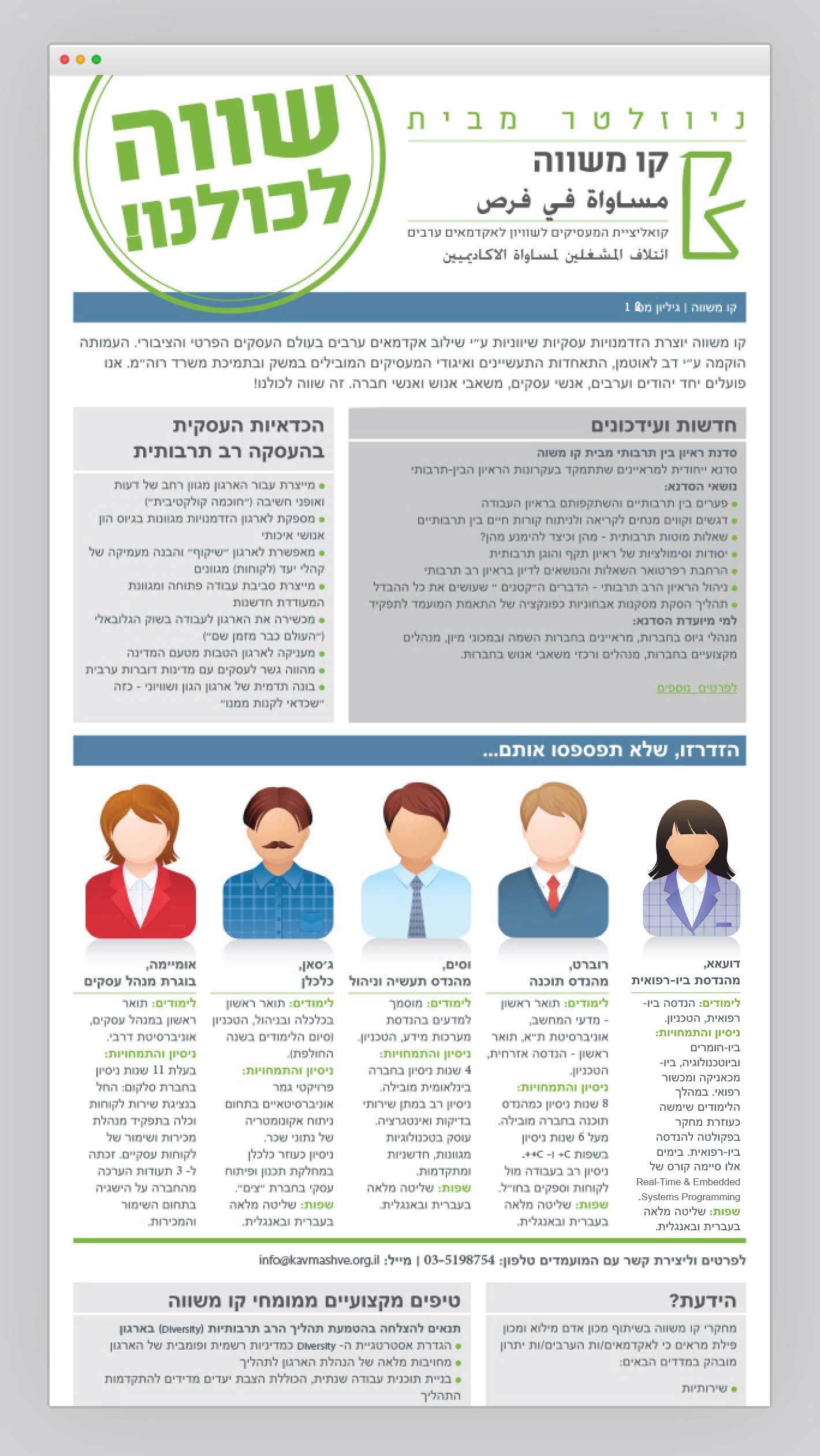
עם הרחבת הפעילות של העמותה לתלמידי תיכון במגזר הערבי, התבקשנו לקחת את המיתוג הקיים צעד נוסף ולקרב אותו גם לבני נוער, לשם כך הוספנו אייקונים, הרחבנו את הפלטה הצבעונית ובחרנו פורמטים פחות סטנדרטים שהוסיפו למותג את הרעננות ופתחו אותו לקהל יעד נוסף.
Kav Mashve is a non-profit organization that was established to promote the integration of Arab college graduates into Israeli businesses.
When we approach a new branding project, the first and most important thing is understanding the target audience – their language, culture, and customs. Therefore, the brand for Kav Mashve – targeting Israeli business on one hand and young Arab people on the other – had us searching for the common thread that connects these two audiences.
When we worked on the logo we made a connection between the Hebrew and Arabic alphabets, creating a clear, bold typography that conveys the brand message.
With the expansion of the non-profit's activities to include Arab high school students, we were asked to take the existing brand one step further and make it appealing to teenagers. That's why we added icons, expanded the color palette, and chose less standard formats that add a fresh look to the brand.