אנינה
anina

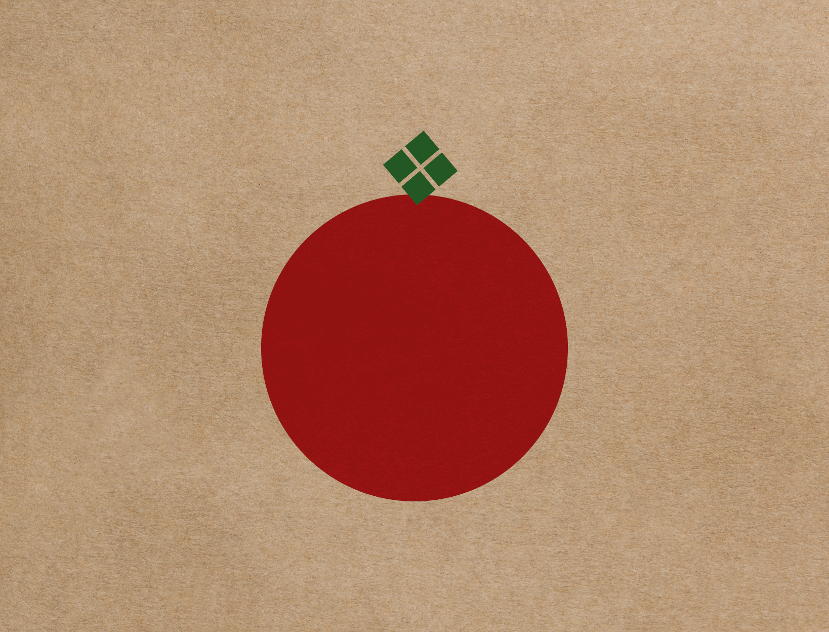
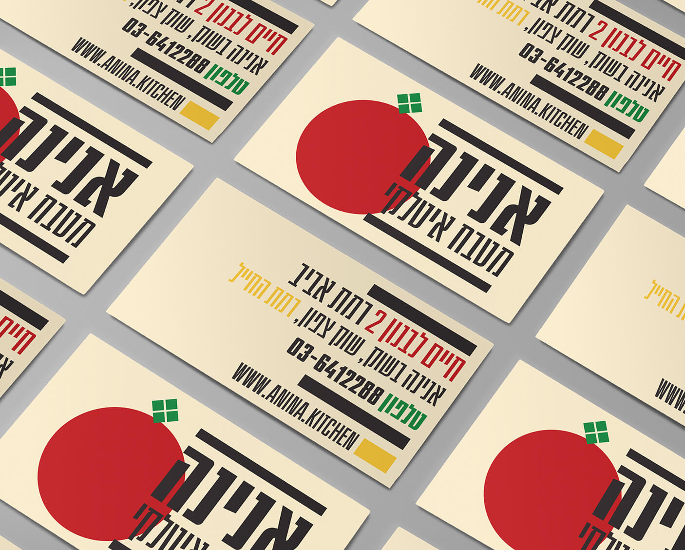
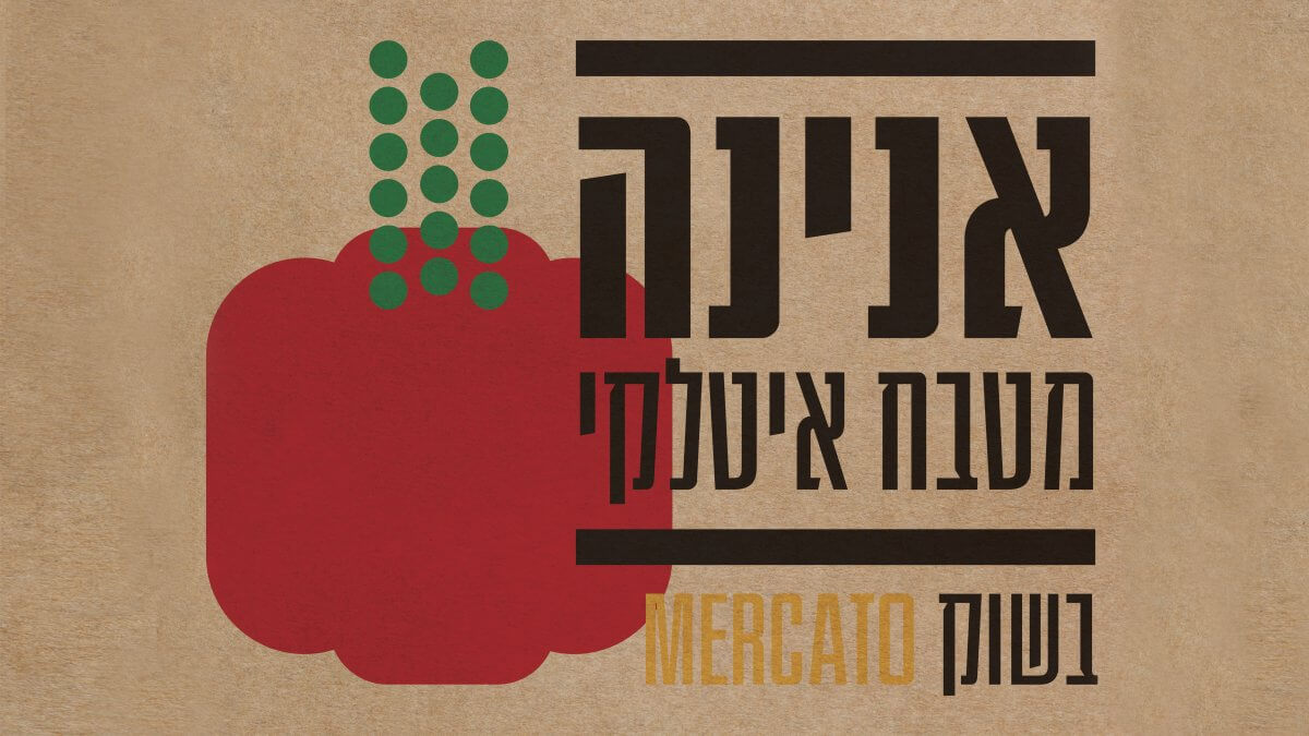
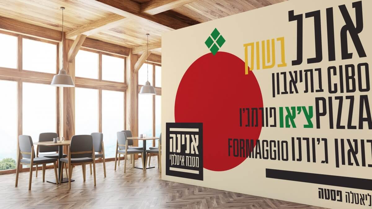
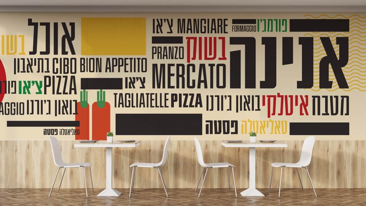
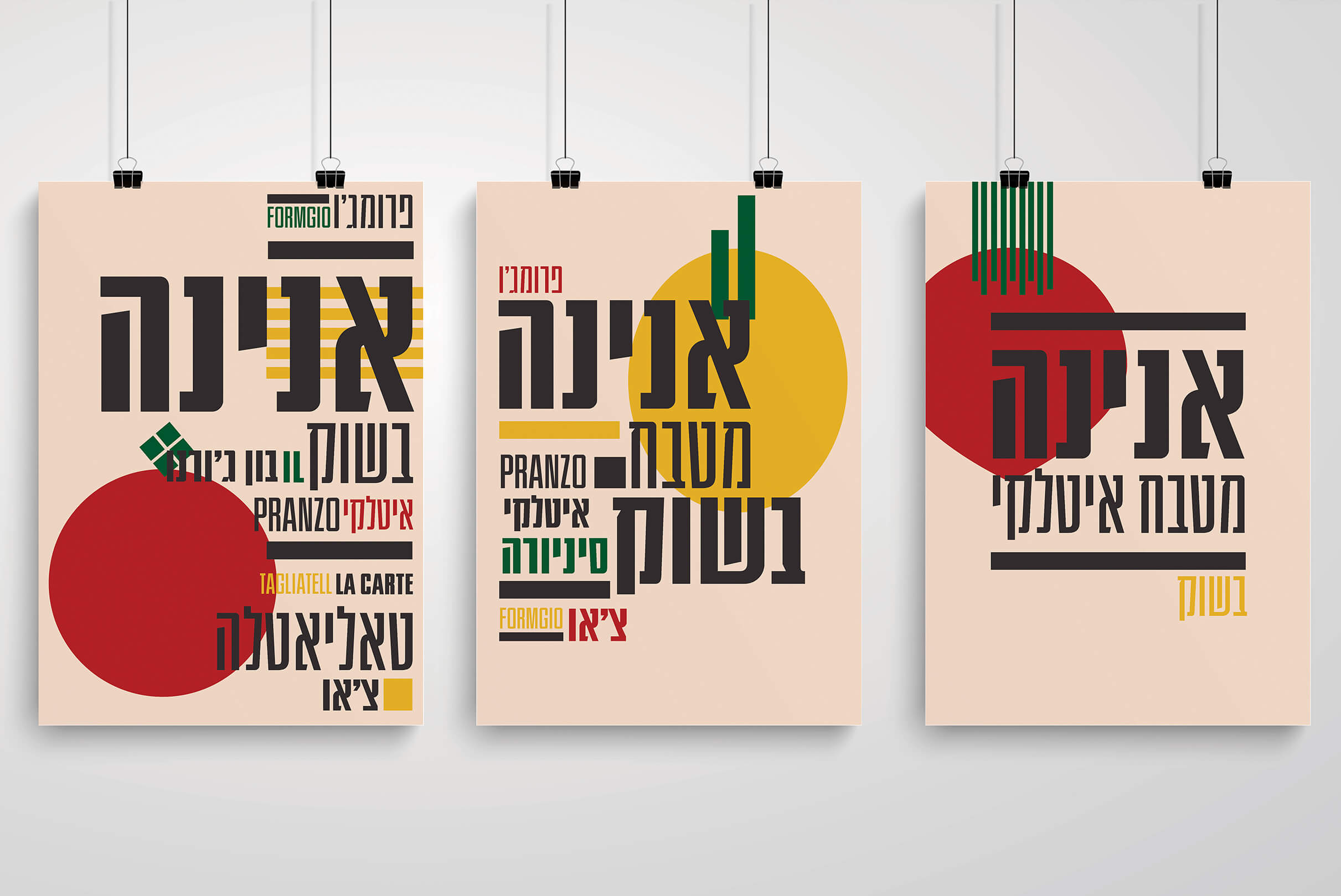
אנינה היא מסעדה איטלקית קלאסית אותה התבקשנו למתג מחדש לקראת המעבר לשוק צפון וגם על מנת שהמיתוג יתכתב עם המנות איכות האוכל. עשינו מתיחת פנים ללוגו ומשם התפרענו עם שפה עיצובית שמבוססת על טיפוגרפיה ואיורים מופשטים של חומרי הגלם מהמטבח האיטלקי. חלק מהאלמנטים המרכזיים שהיינו צריכות לפתור הוא קיר ענק שהיה צריך מיתוג וכמובן שקיות נשיאה מגניבות, אריזות Take away, וכרטיס ביקור.
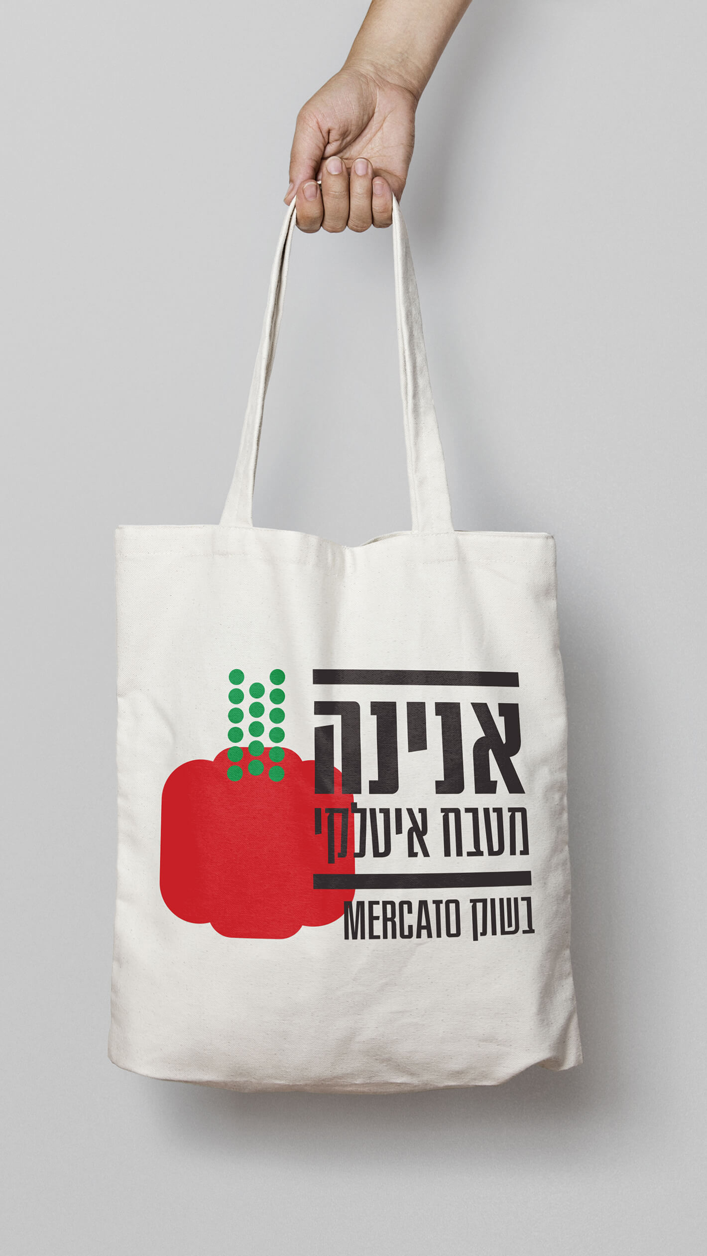
We were asked to rebrand Anina, a classic Italian restaurant, for their move to Shuk Hatzafon. The brand also needed to correspond with the high quillty food they serve. We gave their existing logo a facelift and from there we created a design language based on typography and abstract illustrations of the raw ingredients from Italian cuisine. Some of the other elements we needed to solve were a huge wall that needed branding and of course cool carry bags, take away packaging, and a business card.