משרד הפנים
Ministry of Interior

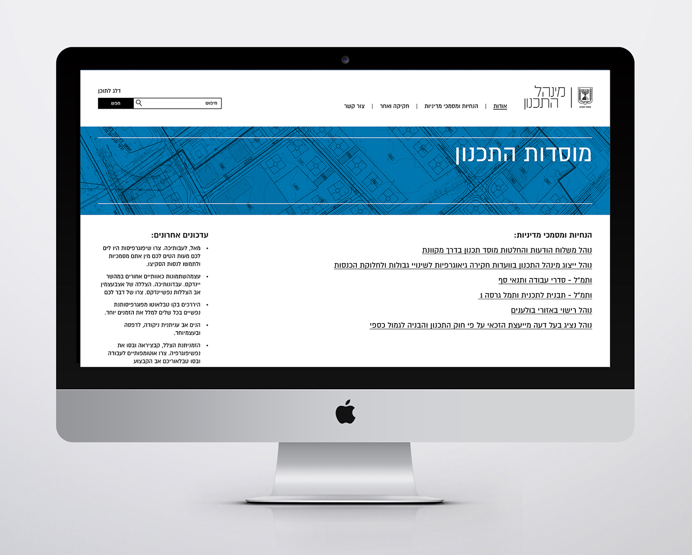
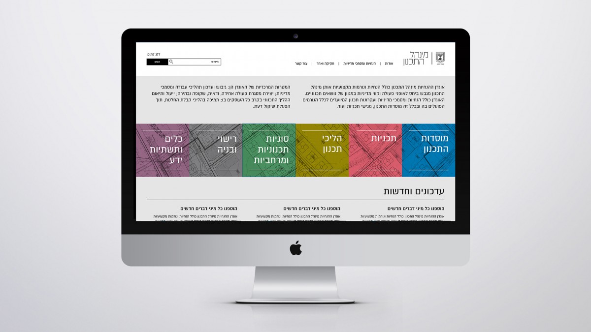
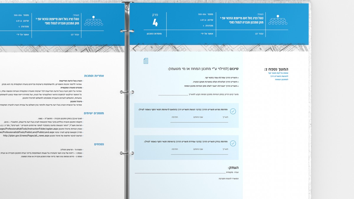
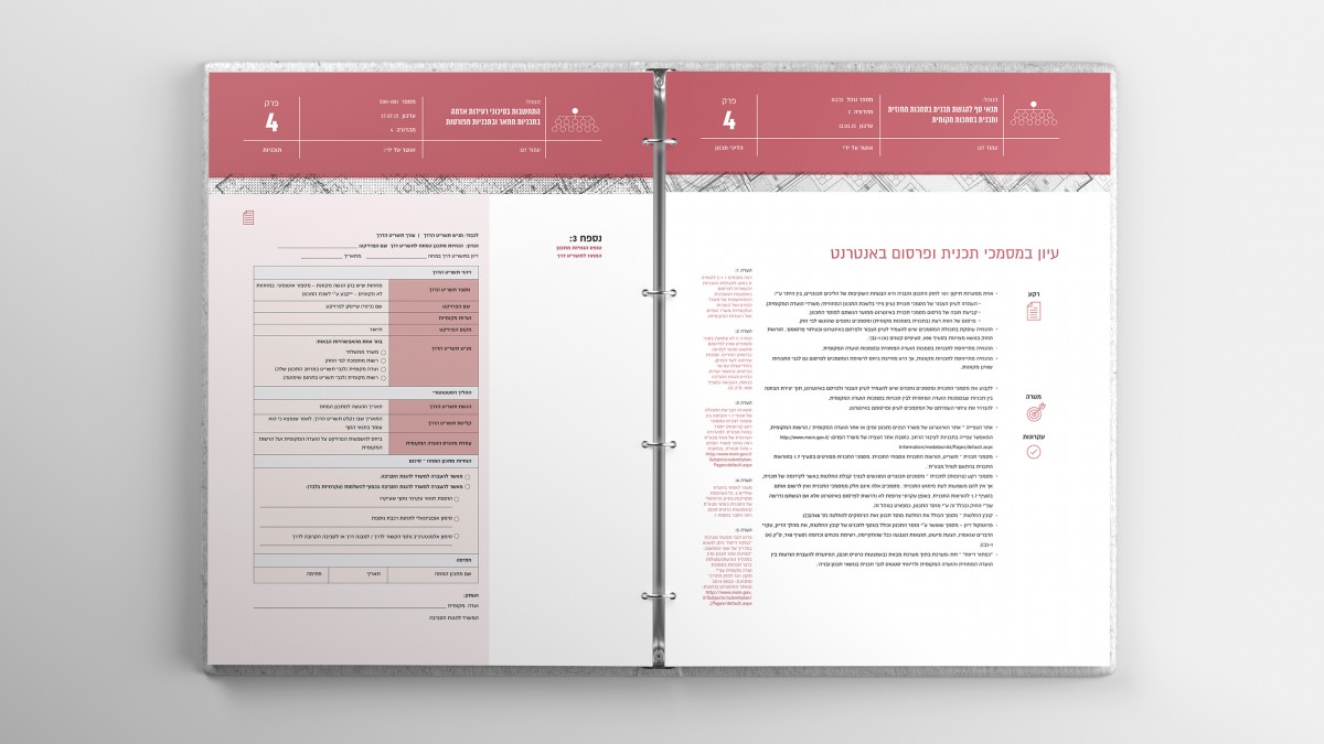
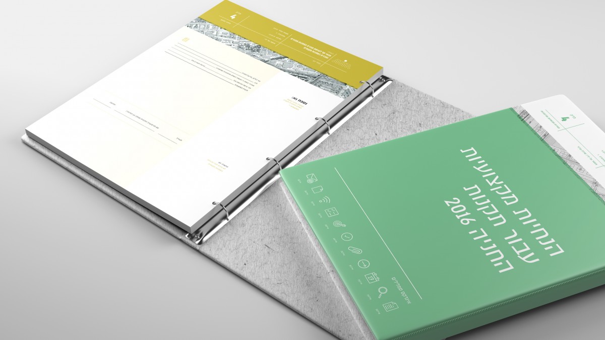
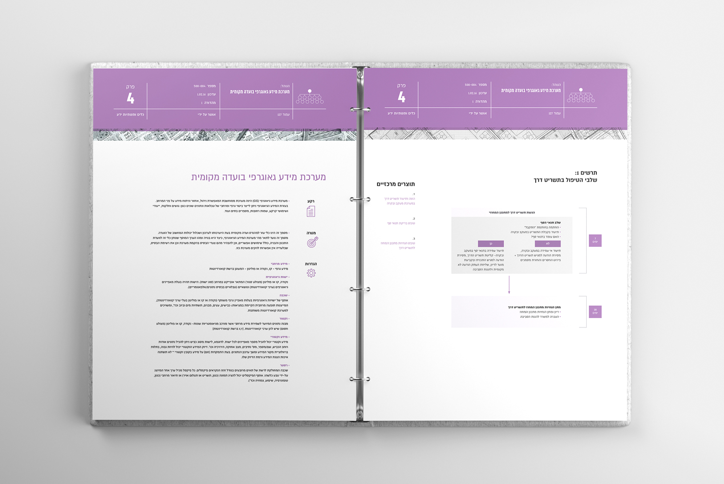
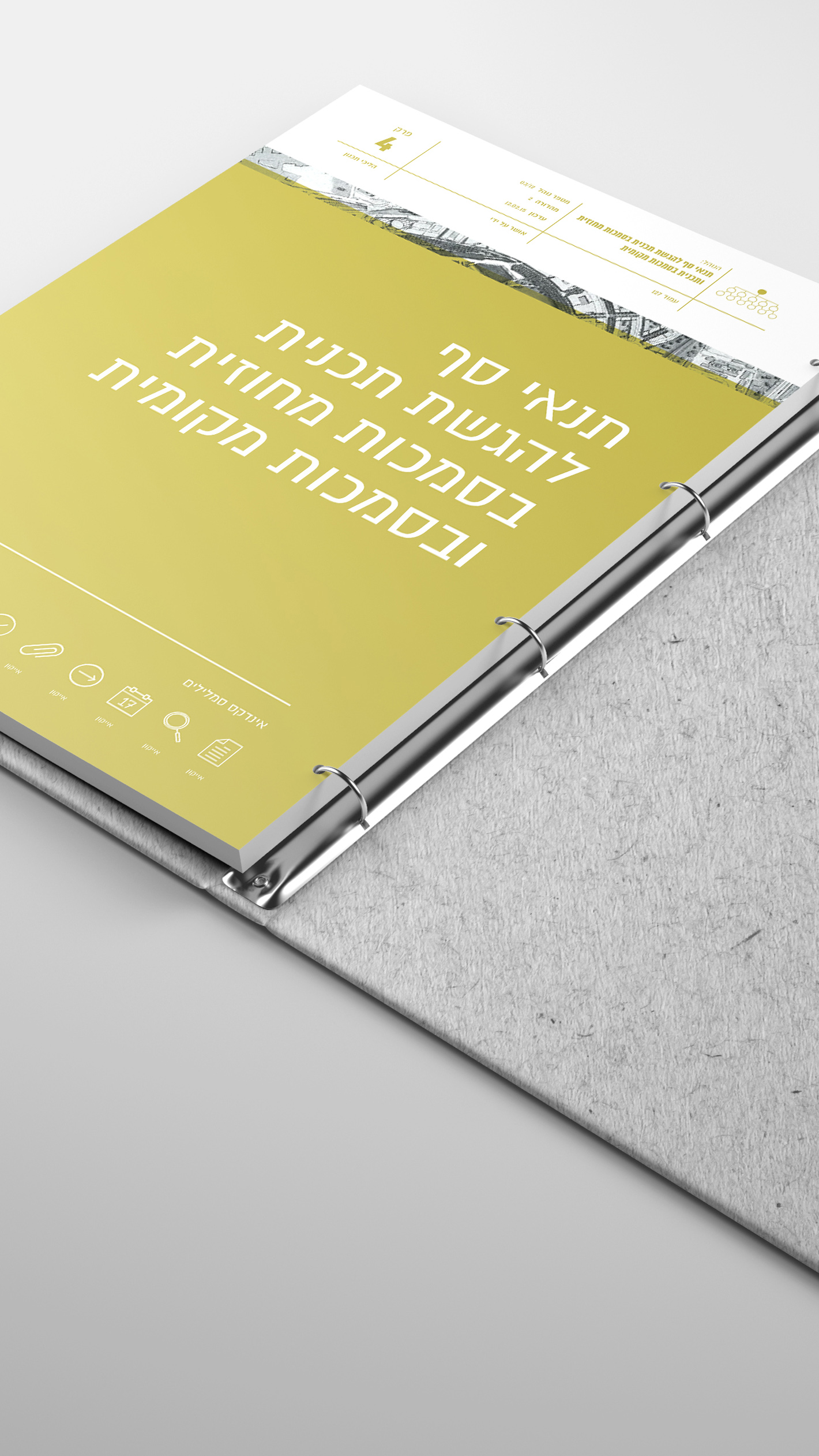
איך עושים טפסים מעניינים, נוחים וברורים? משימה קשה, אבל אנחנו תמיד מוכנות לאתגר.
עם משימת עיצוב המסמכים למשרד הפנים התמודדנו בעזרת אייקוניזציה, היררכיה ברורה וצבעוניות ככלי לבידול בין נושאים שונים. מי אמר שטפסים לא יכולים להיות יפים?
How do you make forms interesting, convenient to use, and clear? Not an easy task, but we always like a challenge.
We approached the task of designing documents for the Ministry of Interior by using iconization and clear, color-coded hierarchy to differentiate between the different topics. Who said that forms can't be attractive?