איי בי דנטל
AB Dental

עיצוב שפה לחברה לייצור שתלים, דוגמת AB Dental הציב בפנינו אתגר משמעותי: רצינו לייצר בידול משמעותי עבור החברה, שיתבטא בכל מפגש עם החברה ומוצריה.
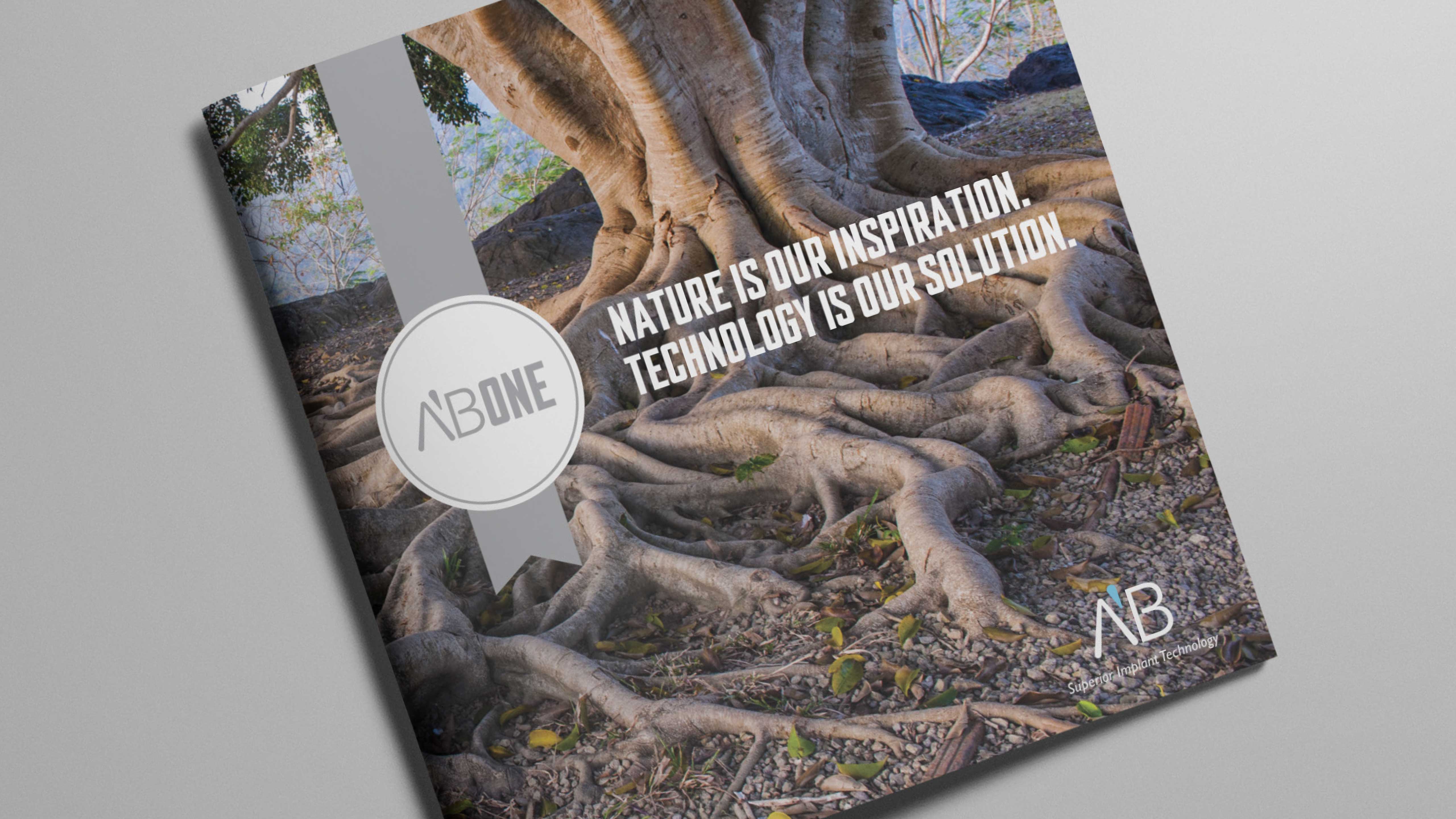
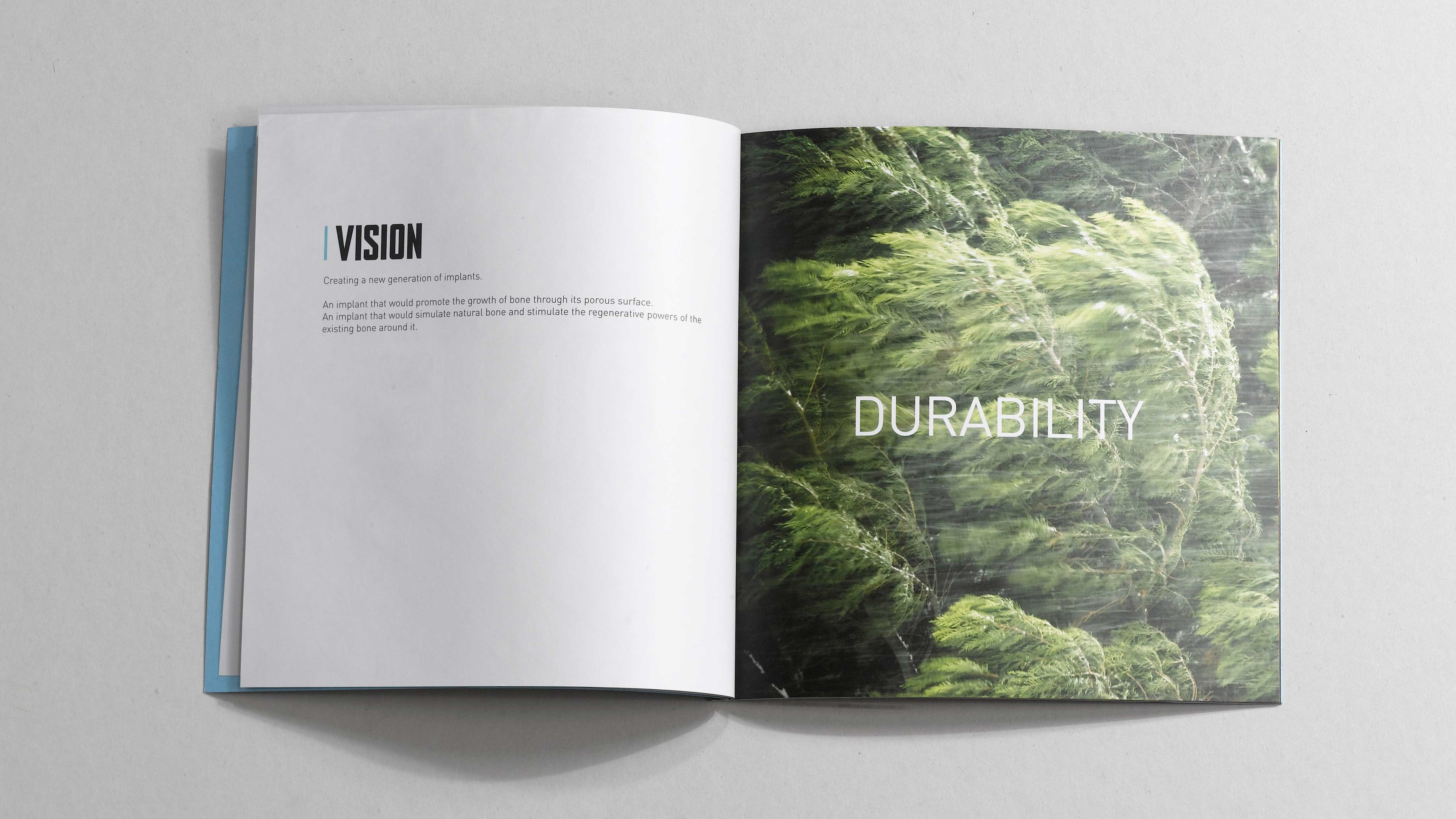
לכן בחרנו להתרחק מהשפה העיצובית המקובלת בעולם רפואת השיניים, של שיניים צחורות וחיוכים מאירים.
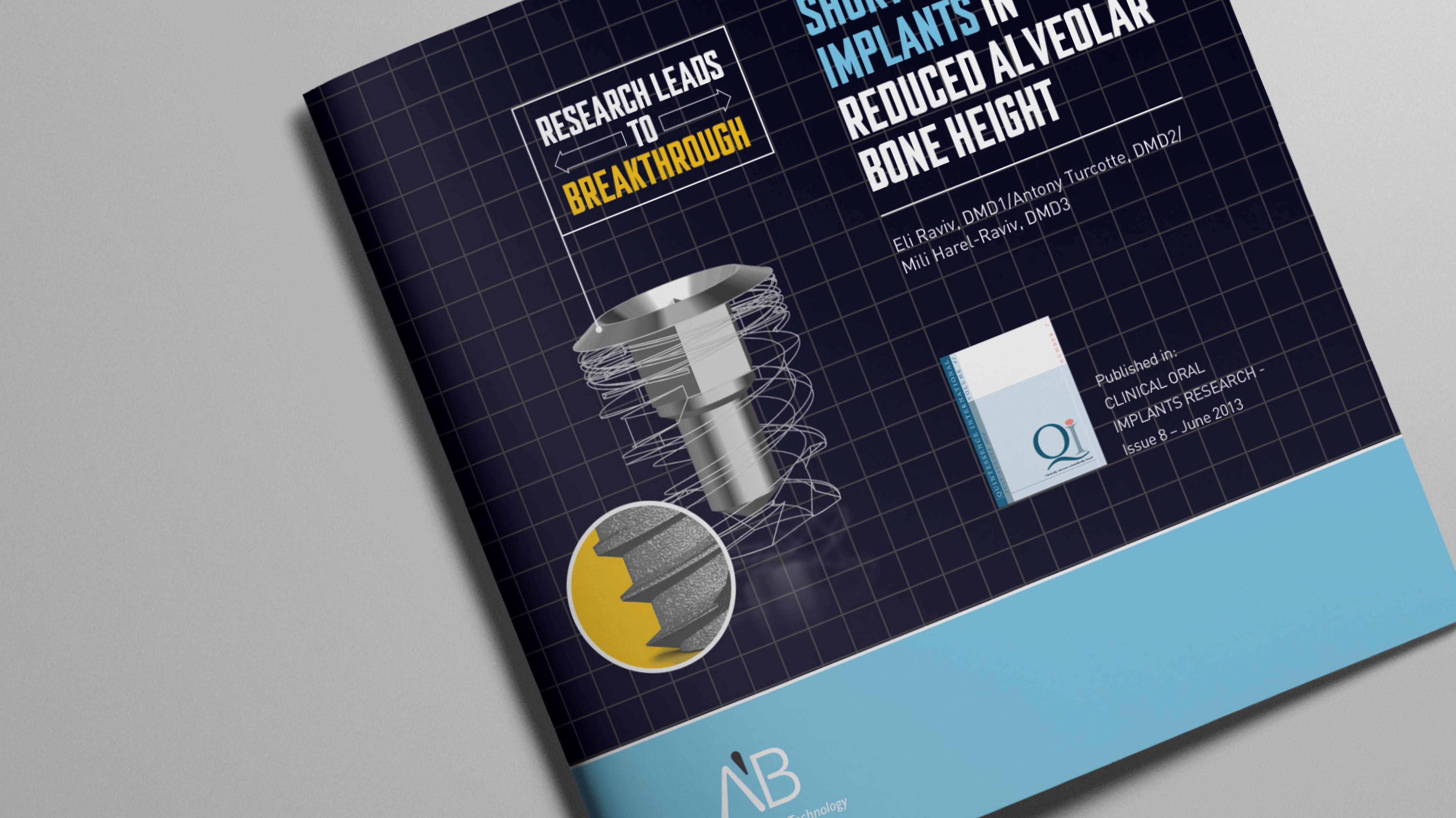
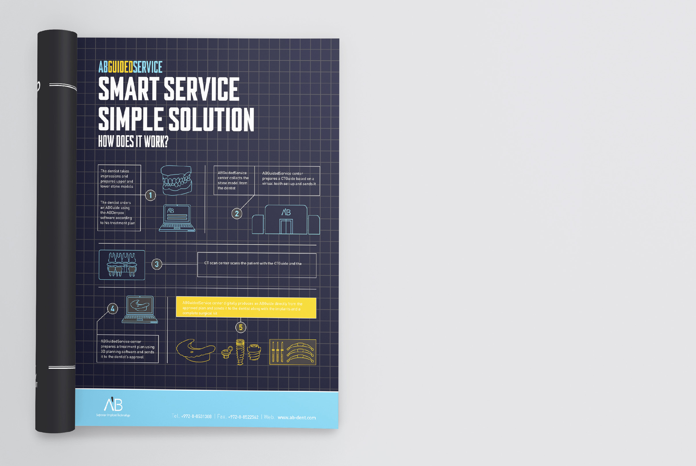
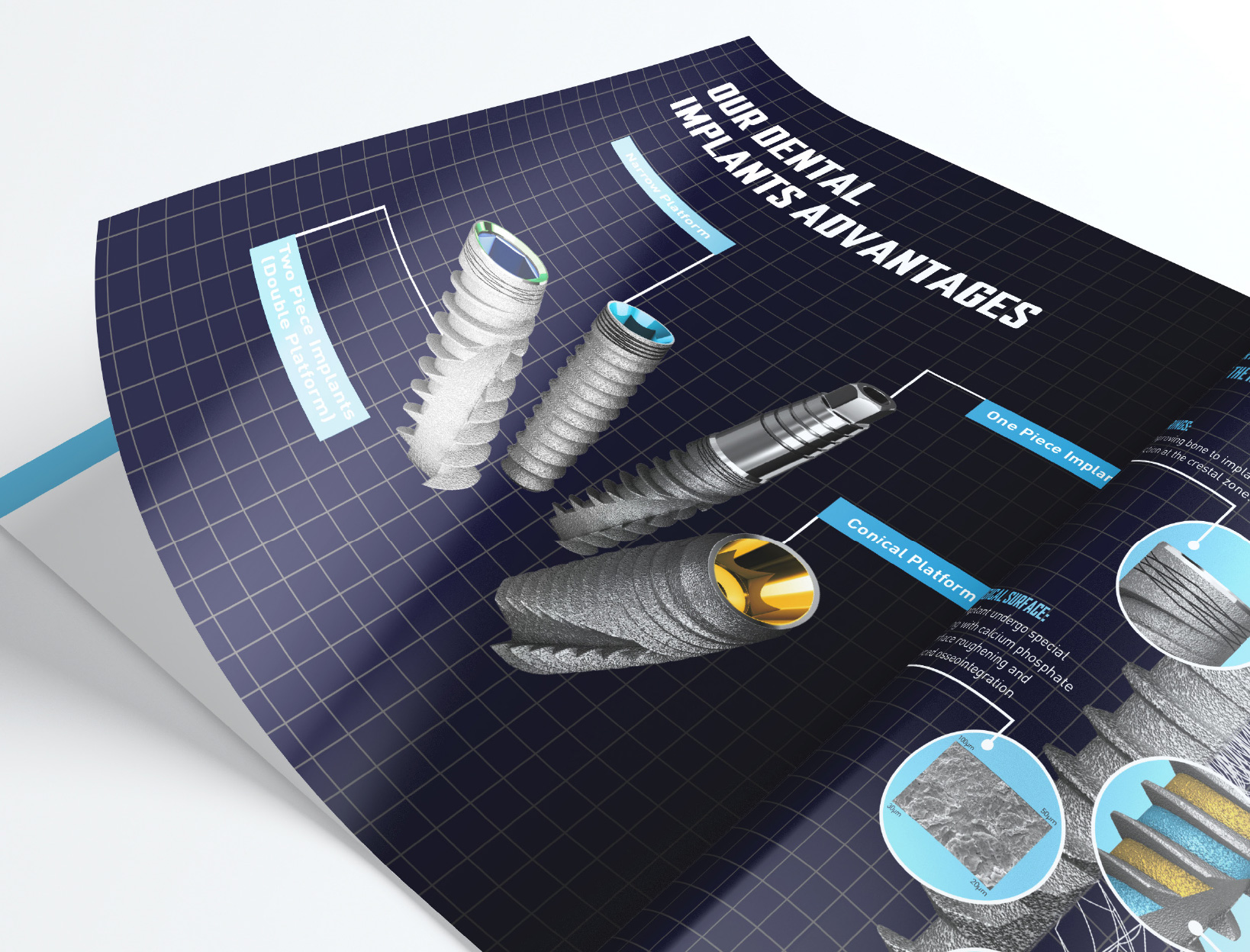
שאבנו השראה מעולם ה-Blue Print (שרטוטים תכנוניים) ויצרנו שפה המעבירה מסרים של דיוק, יצירתיות, חדשנות טכנולוגית ומקצוענות, באמצעות איורים תלת ממדיים על נייר מילימטרי שבאה לידי ביטיו בכל חומרי החברה.
קונספט: שלומית קוטיק
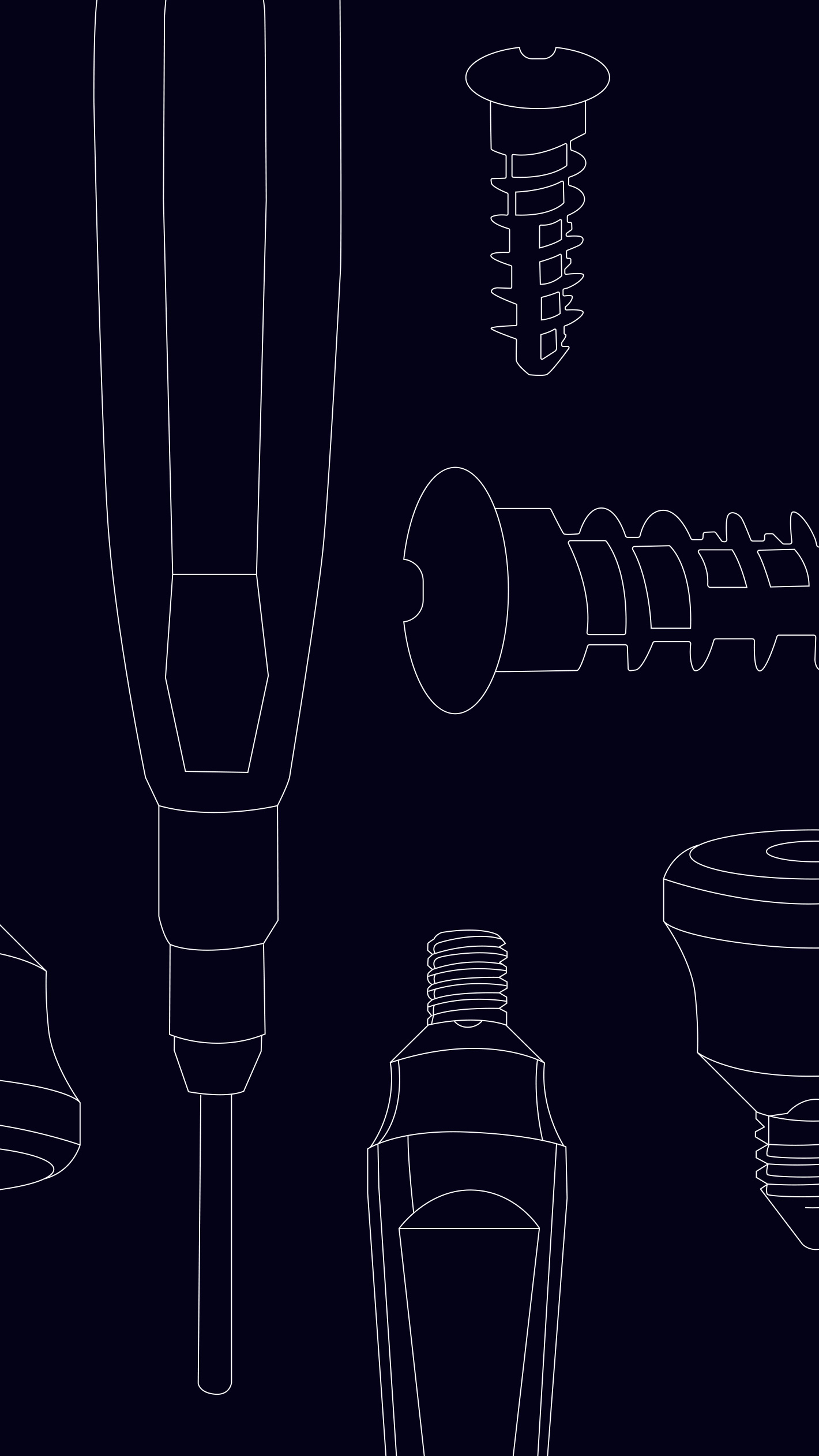
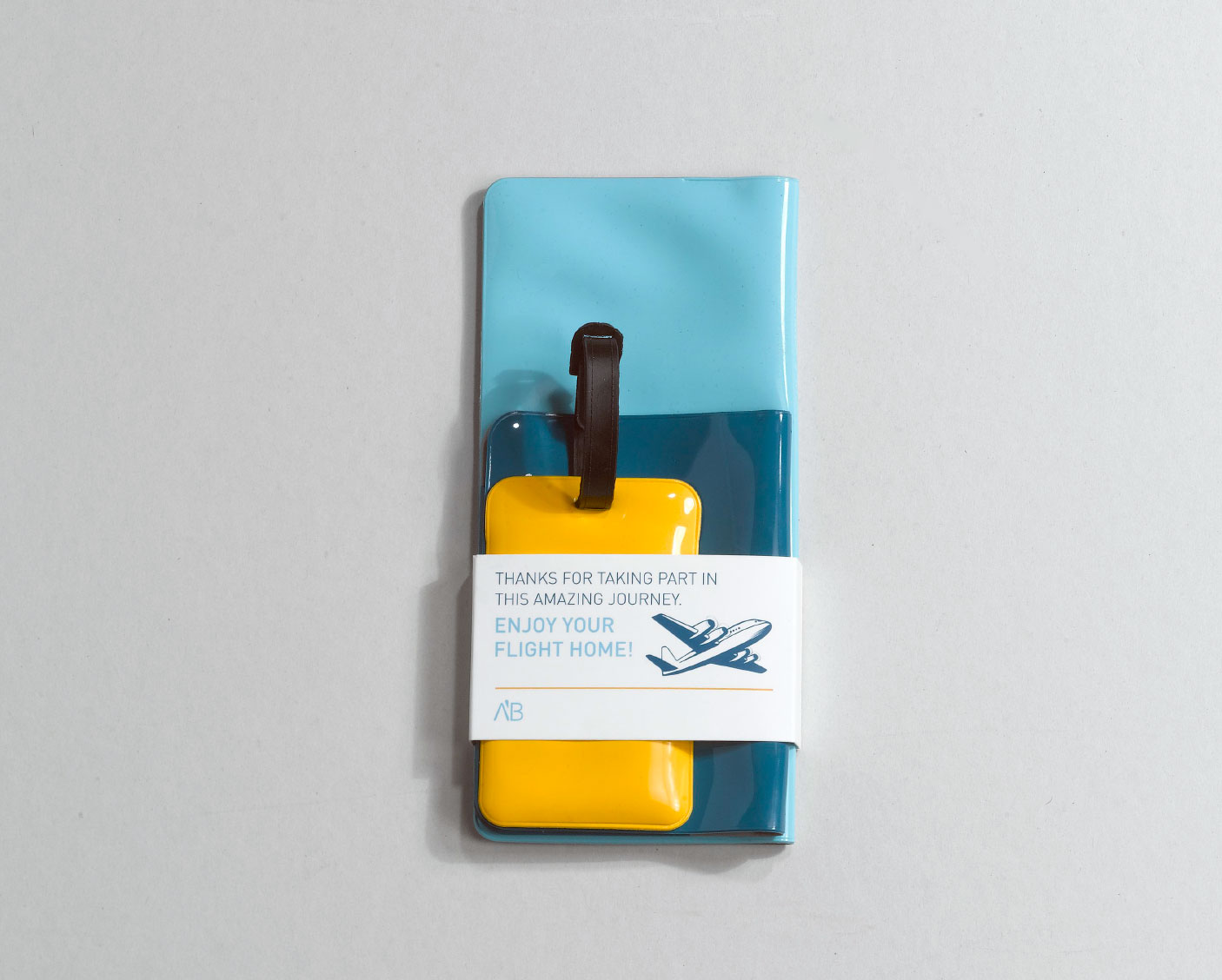
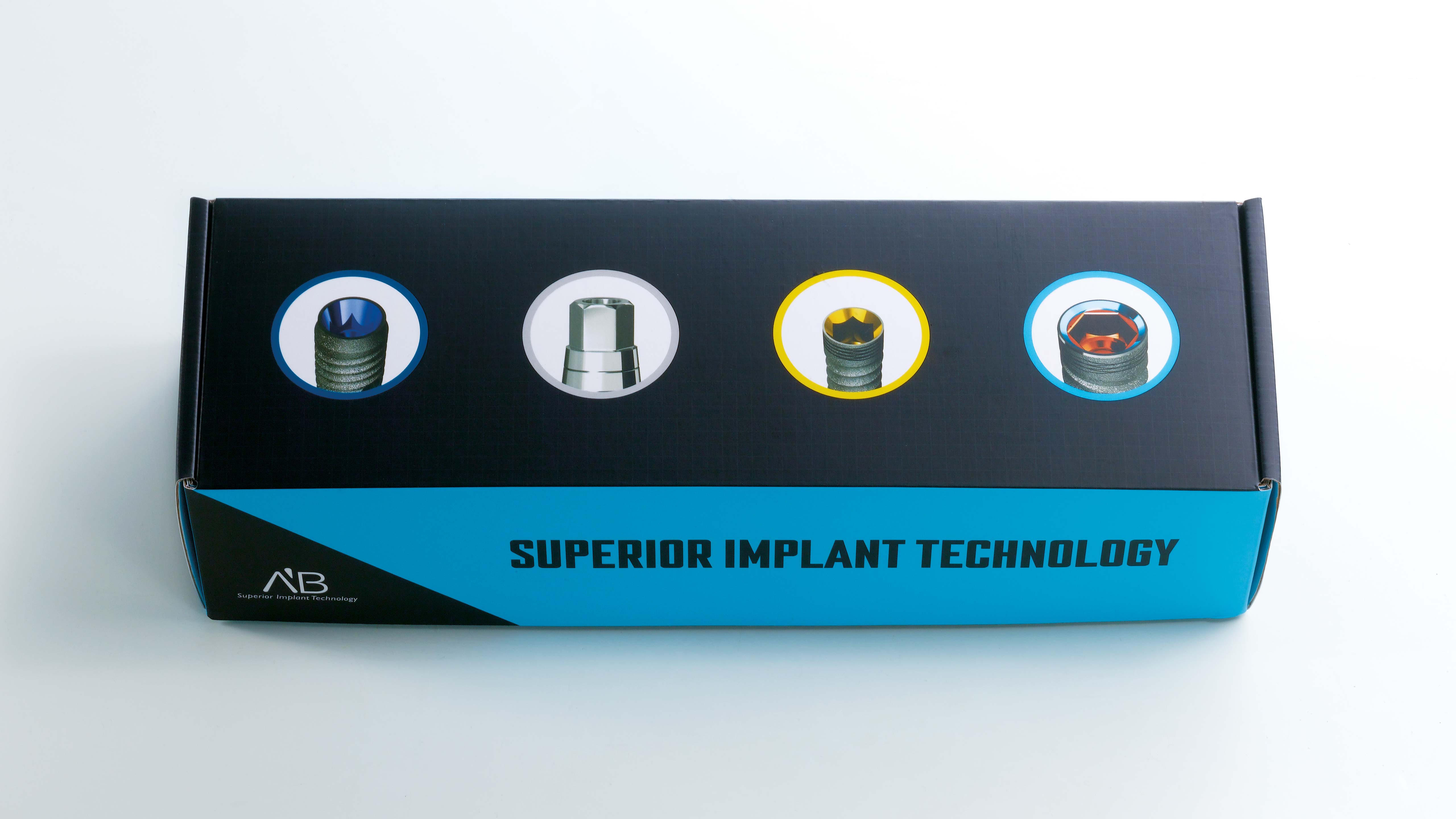
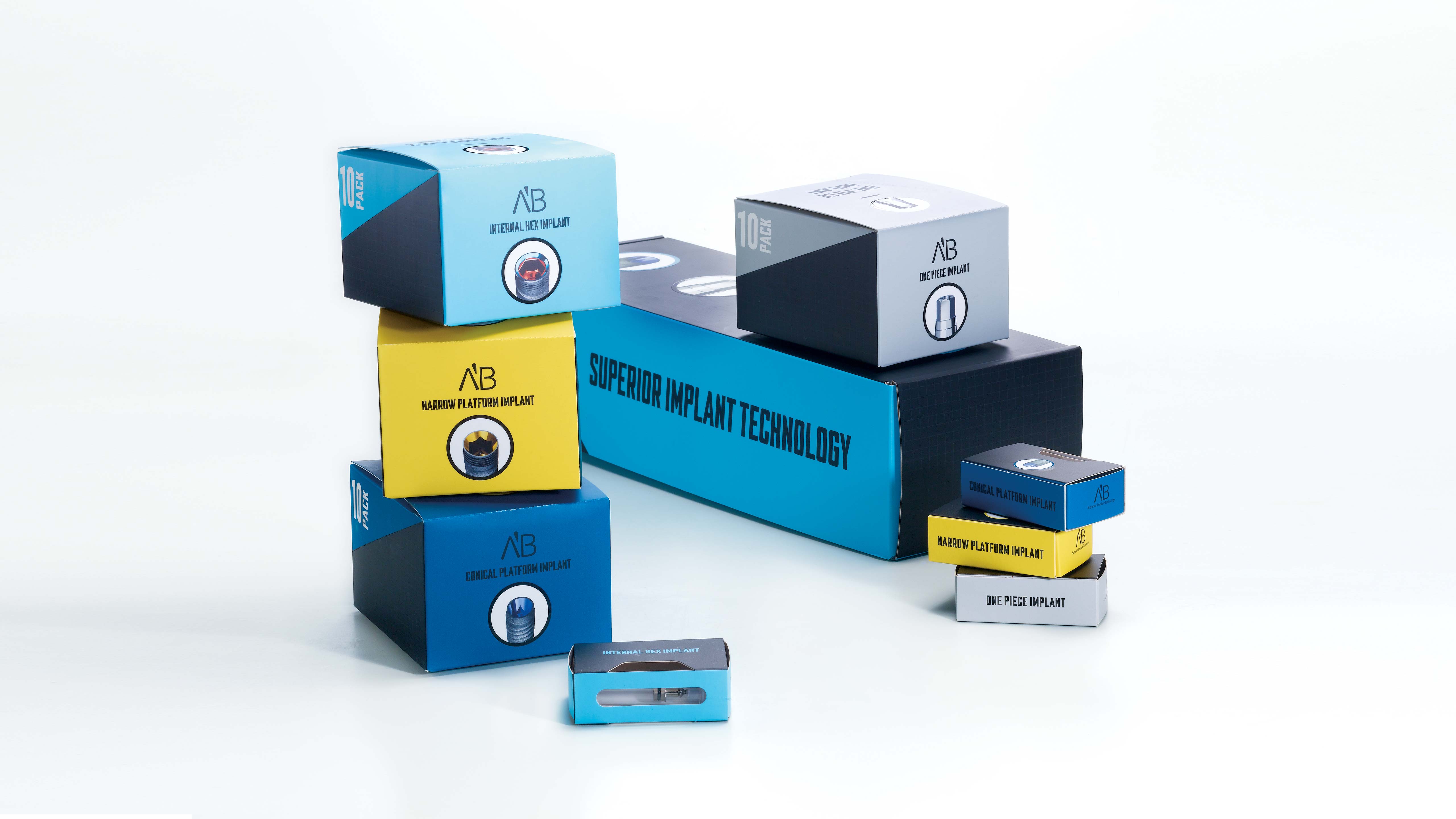
Designing a language for a company like ABDental (that specializes in dental implants) presented an interesting challenge. We wanted to differentiate this company from its competitors, so it and its products would always be recognized.
We chose to steer clear of typical dental imagery (smiling faces with white teeth) and were inspired by blueprints to create a language that conveyed precision, technological innovation, creativity, and professionalism. All company materials include 3D drawings of their products on graph paper.
Concept: Shlomit Kotik