CytoReason

חברת סטארטאפ בתחום המדיקל שעושה פלאים, חוקרת את תאי גופנו, מחלות קשות ומחברת את כל זה כדי לעזור לאנושות למצוא מרפא להרבה מחלות שטרם הצלחנו להתגבר עליהם. החברה ביקשה להשאיר את הלוגו הקיים וחוצמזה לעצב מחדש את כל היתר.
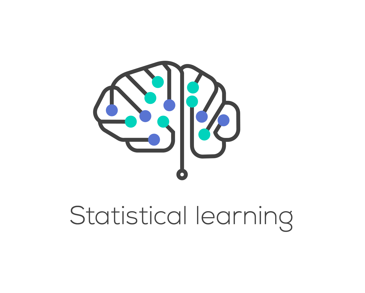
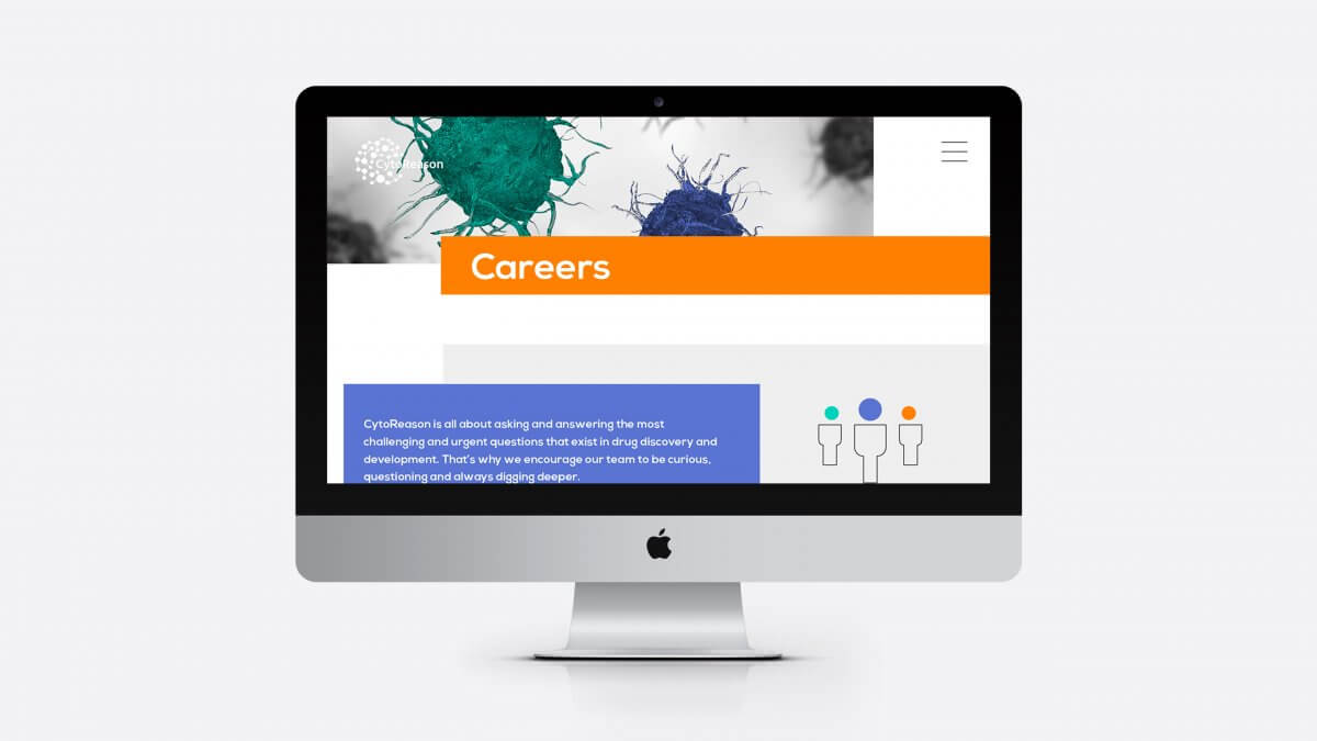
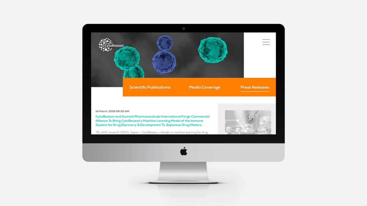
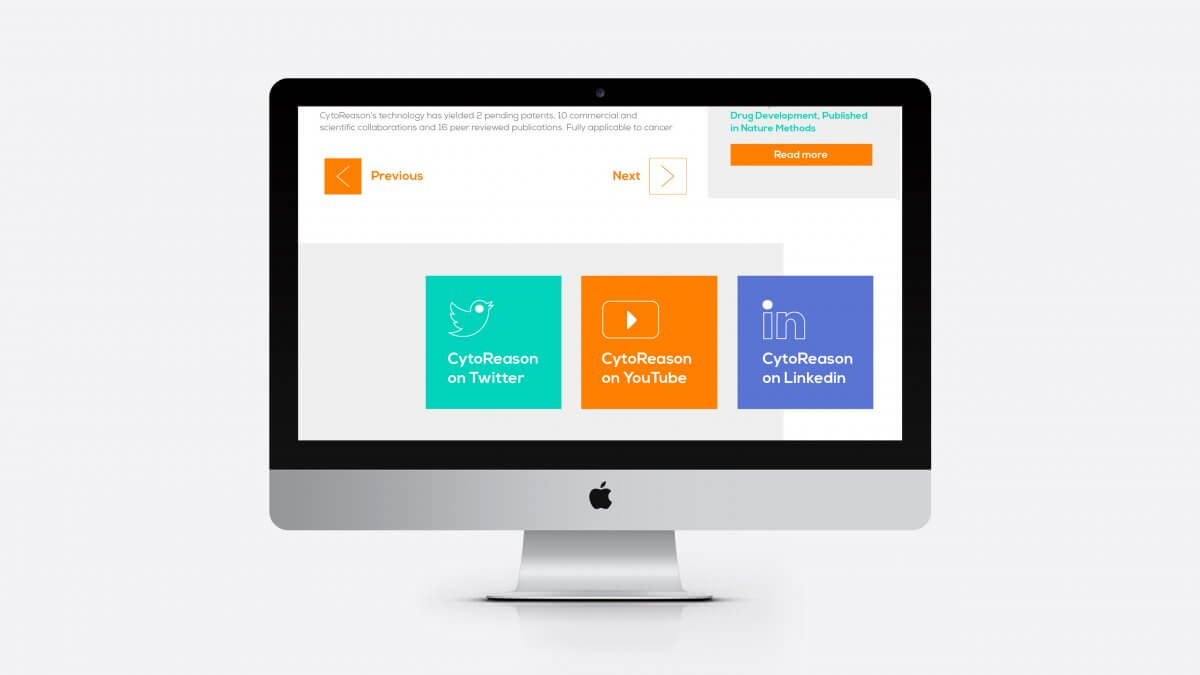
הלוגו נשאר, אבל בצבעוניות חדשה ומשם הרחבנו את השפה העיצובית לכל כיוון אפשרי - שפה חדשה הכוללת: צבעוניות, טיפוגרפיה, אייקונים ואימג׳ים שתואמים את רוח המותג. כל החזון הזה יושם על כל הכלים השיווקים של החברה - מצגות, באנרים, ניירת, אתר וכמובן ספר מותג
Brand center שיגרום לכל עובדי החברה לעבוד לפי הכללים וליישם את מה שעשינו.
פיתוח אטי הדר
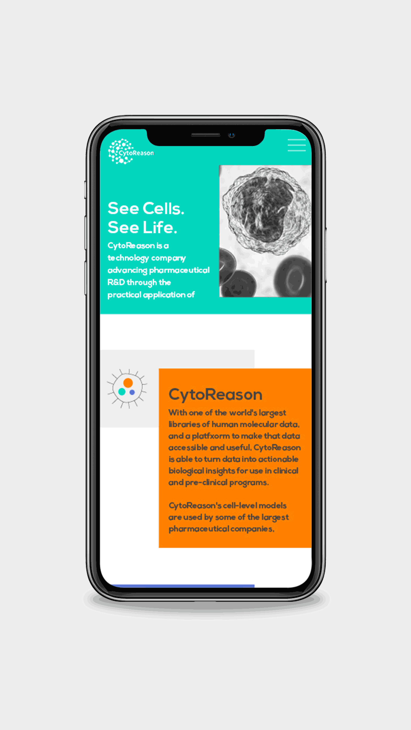
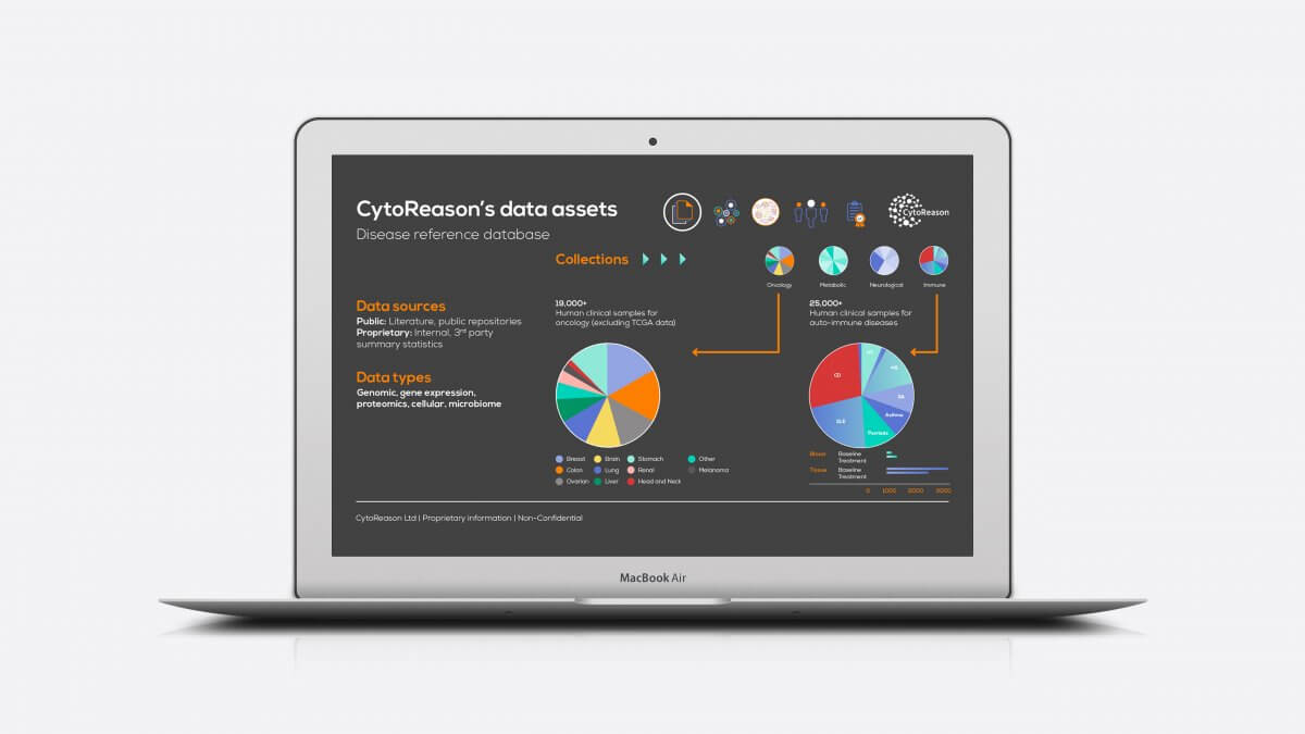
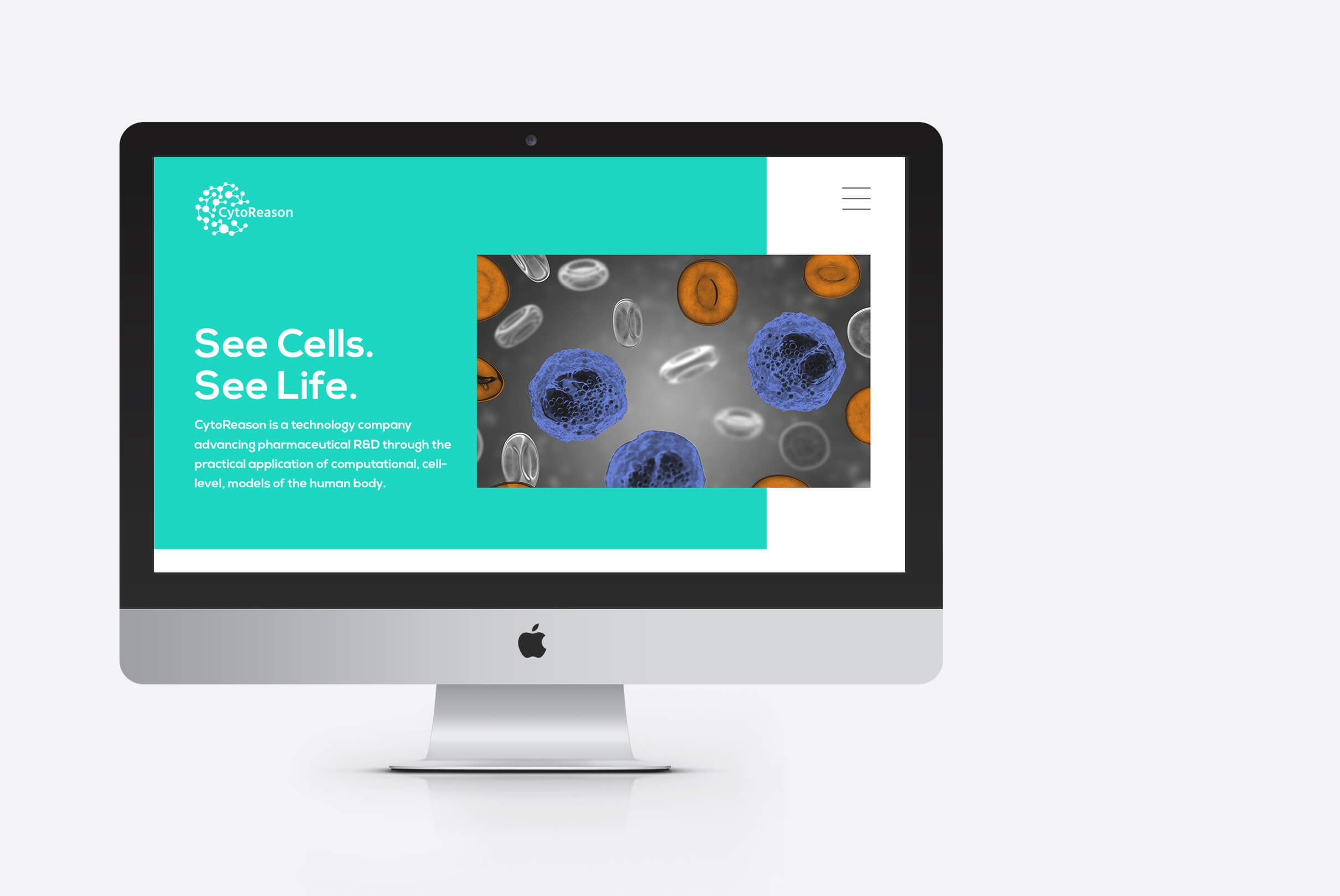
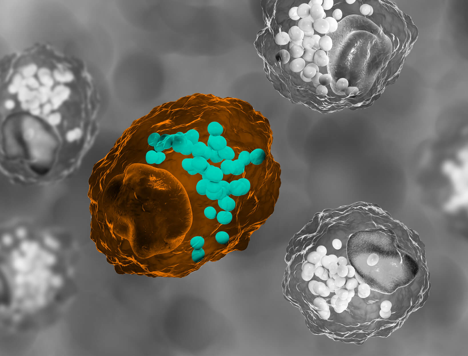
A technology company working with pharmaceutical companies by developing computational cell-level models of the human body. They do wonders by exploring the cells of the human body and serious illnesses with the aim to help humanity find a cure for many illnesses that we haven't yet overcome.
The company asked to redesign their entire brand but requested that we keep their original logo.
And so the logo remains, but with a new vibrancy from which we expanded the design language in every direction. A new language has evolved: colours, typography, icons and images that match the spirit of the brand. All of this vision is applied to all the marketing tools of the company Presentations, Banners, Paperwork, Website and of course a Brand Book and Brand Center.