Gravy

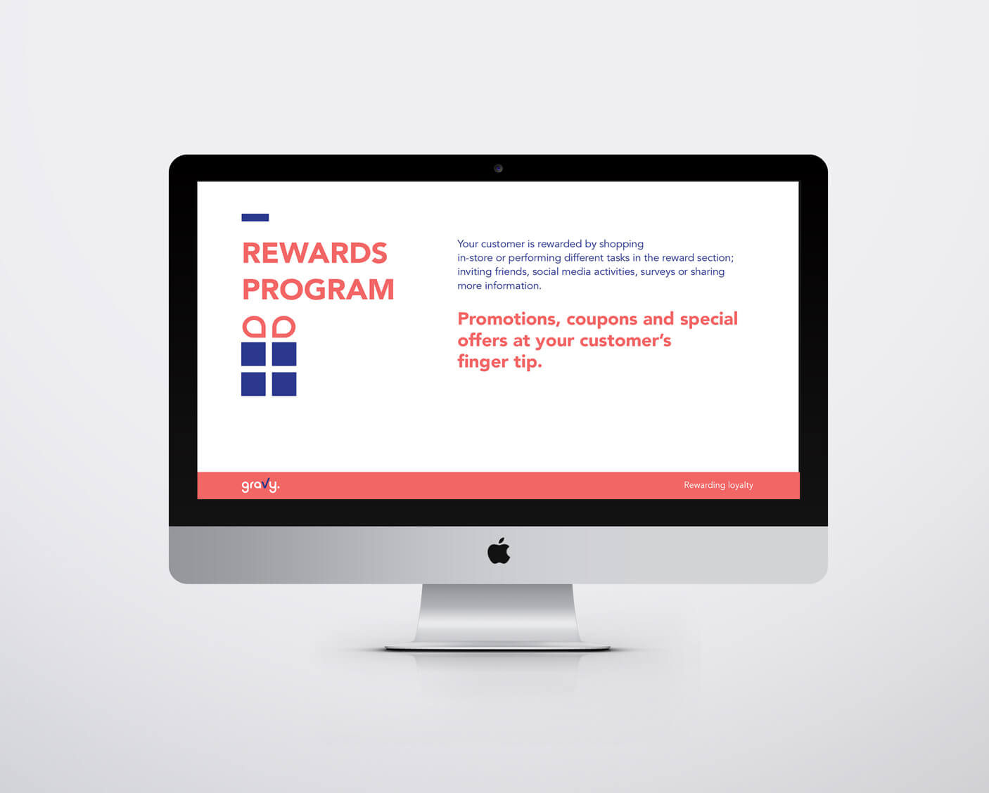
נכון שכולנו עושים קניות באינטרנט, אבל לפעמים אין כמו חווית מותג בחנות עצמה, וזה מה שהלקוח שלנו עושה. החברה פיתחה אפליקציה שמספרת לנו בזמן אמת מה קורה בחנות האהובה שלנו ונותנת לנו את כל הסיבות לבוא לבקר.
כשהתחלנו את תהליך המיתוג היה ברור שאנחנו חייבות לשמור על הנטרליות של המותג כדי לאפשר לו להתחבר למותגים שהוא מקדם, מהצד השני היה לנו חשוב להיות צעירים ורעננים ולתת ליוזרים שלנו סיבה להיות מחוברים לשירות.
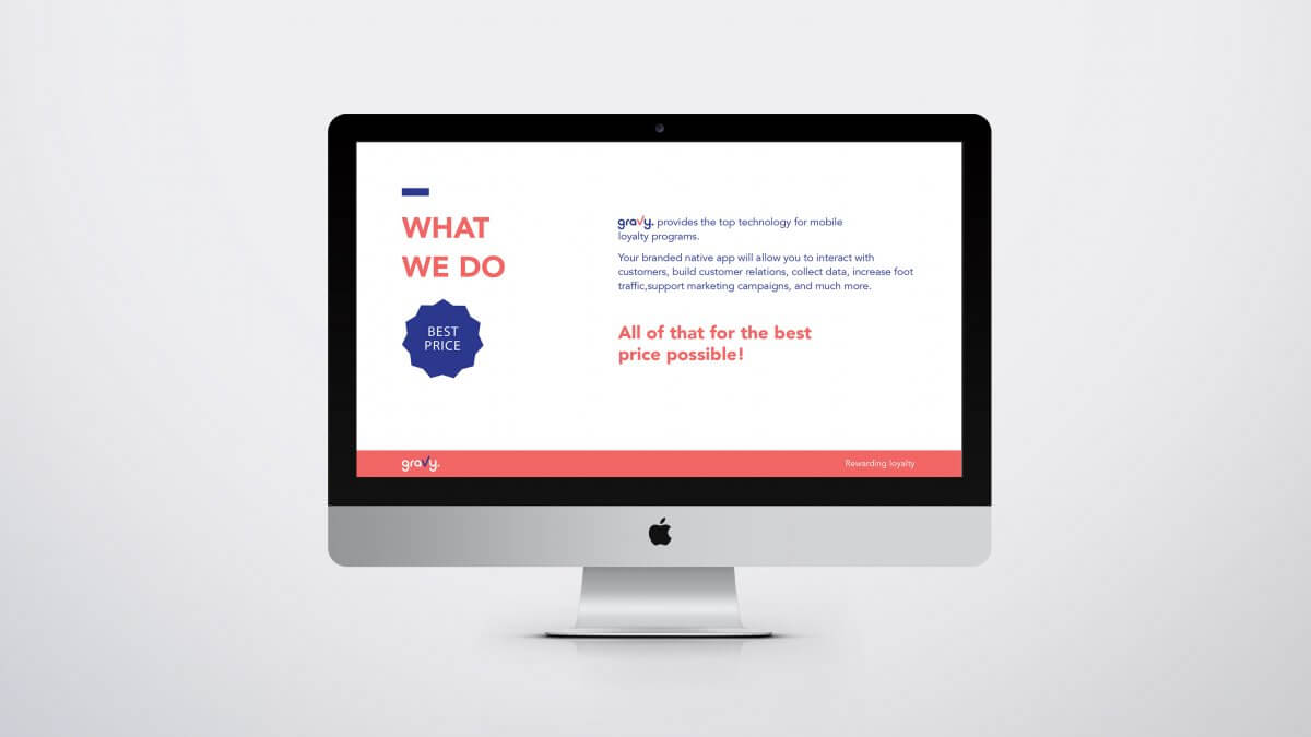
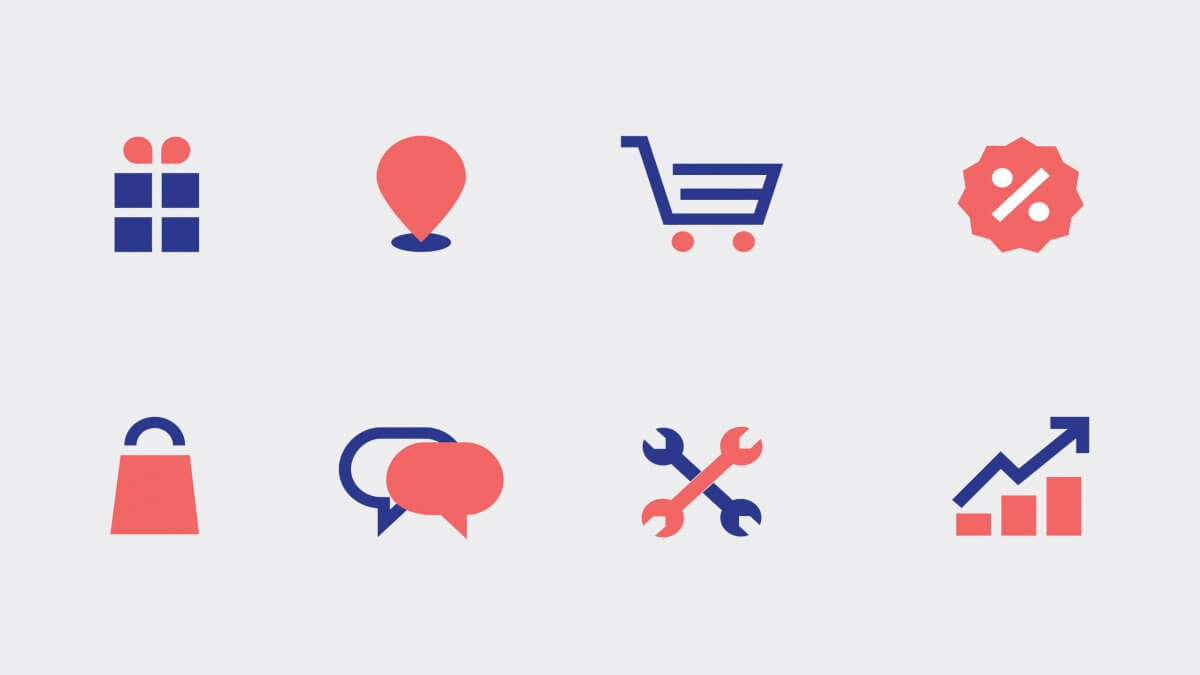
לכן בחרנו פונטים קלאסים ואייקונים מודרנים ומינימליסטים עם קריצה, צבעוניות המורכבת מ-3 צבעים בלבד אך עדיין רוויה ובועטת
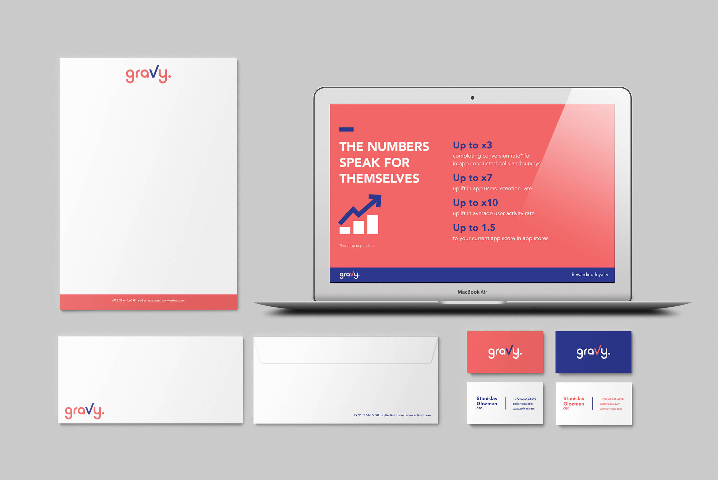
ולוגו נקי ללא התחכמויות מיותרות
It's true that we all shop online, but sometimes there’s nothing like a brand experience in the store itself, which is what our customer does. The company has developed an app that tells us in real time what’s going on in our favourite stores and gives us all the reasons to come visit.
When we started the branding process, it was clear that we had to maintain the brand’s neutrality to enable it to connect with the brands it promotes.
That’s why we chose classic, minimalist, modern fonts with a wink, with only 3 colours but still saturated and kicking
And a clean logo without being unnecessarily fancy.